|
A bittersweet moment at last week’s RGS conference where came to the end of my term as chair of the Digital Geographies Research Group, handing over leadership of the committee at the AGM. The RGS has some very sensible rules that committees should regularly rotate their memberships in order to keep new ideas flowing and stop fiefdoms and cliques developing. Having helped set up the group in 2016 and served as its chair since 2020 it was my turn to be shuffled off the committee.
It has been a really fun group to be involved with though I’ll admit that I was looking forward to the end of my term and having a bit more time for other things. DGRG wasn’t the first group doing digital geographies, but it created an umbrella to gather together activity within the UK. Indeed, perhaps its most significant achievement has been to lend institutional legitimacy to early career scholars in the UK who are starting to work on questions around the digital. Service activity such as committee work for research groups is one of the less glamorous parts of the sector and, indeed, is sometimes talked about as the ‘domestic labour’ of academia – essential, uncelebrated and disproportionately undertaken by women. One of my previous line managers always argues that professional bodies like the RGS will take as much of your time as you give them and hence to not let service take over your life. My view in running the group was to be realistic about what activities our committee and membership actually had the capacity to undertake, rather than engaging in initiative-itis and thus undermining the group’s goodwill and enthusiasm. Most of the work is, of course, undertaken by committee members volunteering to take on particular tasks, with my role having basically been to act as a coordinator and facilitator. As a result, I can’t claim credit for the various important projects that happened under my watch, including drawing up an EDI statement for the group, setting up a dissertation prize and establishing a YouTube channel. Lots of people to thank, not least Sammia, Godwin, Harrison, Jack, Daisy, Jeremy, Hannah, Olivia, Nina and Caitlin from this year's committee, and Doug who volunteered to run this year's (logistically complex) hybrid symposium despite having stepped down from the committee last year. Despite the pandemic, we managed to keep our programme of annual symposia running. Pre-pandemic we ran these as virtual/in-person hybrid events so the shift to online-only wasn’t particularly problematic for us. Indeed, we found larger audiences as people got more used to the idea of attending a symposium virtually. As a result of one of these onlilne symposia, we got an invitation from Edward Elgar to put an edited collection together. The result was A research agenda for digital geographies edited by Tess Osborne and myself, which came out earlier this year. Tess has just taken over chairing DGRG – I’m sure she’ll be much more active than I was! It’s nice to hand things over at the point where digital geographies is well established as an area of work within UK Geography. As the edited collection and other activities within the group have demonstrated, this is a thriving area, with lots of really enthusiastic early career folk doing fantastic work. It’s been great working with the group but I also enjoyed getting a bit more involved with the RGS itself, which is an organisation filled with dedicated and hard working people. For all that I’m relieved to be taking a step back to focus on other elements of my research, I’ve no doubt that I’ll be drawn back into service with/for the RGS in the future. Although service activities can be a bit of a chore, it’s rewarding to spend at least some time working for the greater good of the discipline rather than just on your own career goals.
0 Comments
 Well, I’ve been after a pair of eyetracking glasses for about five years, ever since I found out that such a thing existed. Now, I finally have a pair in my office. Yes, I am as excited as a six year old at Xmas. We’ve bought a really nice piece of kit from Pupil Labs, a Berlin-based company who have acted as disruptors in the eyetracking market which has hitherto been dominated by Sweden’s Tobii. As promised in their literature, the glasses are lightweight and comfortable to wear. For my taste they’re a bit ‘nerd chic’ but they don’t look especially weird. Pupil Labs have a new piece of kit coming out later this year which allows you to have much more customisation and stylish frames, but even so, the glasses don’t look like anything particularly remarkable. Which is, of course, perfect. Some of the work I read about mobile eyetracking (MET) written in the early/mid-2010s had participants talking about how self-conscious they felt wearing the rather alien-looking glasses in public spaces. These new designs definitely mitigate this and after a little while I didn’t really notice that I was wearing them when having a walk around. My colleague Sang-Hoon in Sports Science has promised to sit down with me at some point and show me how to use the machine learning software he’s built for automatic object recognition. In the meantime, I’ve had a bit of a play with the standard functions that Pupil Labs provide and I’ll admit to being incredibly impressed – not least that you can produce a useful analysis with little to no skill. The glasses plug into a fairly ordinary smartphone which provides power and computational resources. You simply put on the glasses, press ‘record’ on the app and you’re ready to go – no complex calibration or any other setup needed. A side mounted camera records what is in your field of vision while infrared sensors built into the frames monitor your eye movement. Then you simply send your participants off to walk around the environment that you’re investigating. At the end of the data collection, you press ‘stop’ and the app automatically uploads the recording to Pupil Labs’ (GDPR-compliant) cloud server for processing. Then you get a nice video which shows what was in your field of view with an overlay showing where your eyes were pointing in the scene. MET can be used for clinical work, making very precise measurements to examine cognitive response to different stimuli. Most users, however, seem to use them more in a descriptive way – looking at the amount of time spent looking at different objects within the study environment. One of the cleverest things that you can do is take reference photos of an object of interest (an information board, a display case, even something as large as a building) and connect the eye movement record from the head mounted camera onto a still photograph. There’s a little bit of photogrammetry operating in the background to make this work but the upshot is something like this... Here we have a side-by-side comparison showing me looking around the lobby of our building next to a reference image of an information board that is located there. The red dot shows where I’m looking and you can see that the red dot on the right-hand reference image appears in the same places as it does (at different angles) in the eye tracking video. Based on this you can then create a heatmap showing the areas where I had the most fixations as an indicator of the parts of the reference image I paid most attention to. Although Pupil Lab’s inbuilt software currently only allows you to create heatmaps for one user at a time, it’s a fairly simply matter to extract the raw data and create overlays of multiple participants. That allows you to examine whether, say, female participants look at different things in an environment compared to men.
It's cute and there’s much to play with here. There are a handful of people working in planning and urban design who have started to use this technology since it became available but it’s still early days. I’m currently exploring the possibilities of a collaborative pilot project with a colleague in the UAE looking at urban design and sustainability in Ras Al-Khaimah. Similarly, there’s a possibility for doing some work looking at visitor engagement in the Lapworth, the geological museum that is part of my department. If anything comes of either of these, I’ll post an update presently. The last six months have been unusually quiet. After a very busy period during the various Covid-related changes to our working practices, I’ve been given a reduced teaching load this year in order to write some grants. This has been a very nice payback to the lack of research time over the last two years. Just prior to the Xmas break I was finally able to submit a large grant to the ESRC that I’d first thought about in January. The success rate on open call grants is very low, but it’s nice to have a punt at something that I’d really like to work on (it’s about groups of people walking together in VR).
In the last few months I’ve also applied to a number of smaller funding schemes, both internally and externally. Just before Xmas I heard I’d been successful in a bid to a UoB equipment fund which means that in the new year I’ll be able to order a pair of eyetracking glasses and a powerful laptop set up for machine learning. I’ve wanted a pair of eyetracking glasses for years – indeed, I wrote about them on this blog back in April 2018. Pupil Labs are a relatively new entrant to the eyetracking sector but have established themselves as a rival to market leaders Tobii – not least by significantly undercutting their prices and making analysis tools available on an open source basis. This has meant we've been able to ask for a pair of their glasses without needing to seek significant outside funding. For those disinclined to read the previous blog, the basic idea of mobile eyetracking is recording video of what you’re looking at via a front facing camera attached to a pair of glasses. Simultaneously, infrared cameras monitor where participants' pupils are pointing at any moment. Combining these measures means that one can see what people are paying attention to within their field of view. Psychologists use this technology to do some genuinely fascinating work looking at minute variations in speed of movement, fixation and so on to examine questions around individual cognition. People like me, on the other hand, tend to think about the datasets in a more descriptive way – essentially asking what catches people’s attention and how much time they spend looking at different things in front of them. Sang-Hoon Yeo, a colleague from sports and exercise sciences, has done some brilliant work using machine learning analysis of video footage to automatically classify elements within a person’s field of vision (people, cars, green space etc.). This automated process allows a more efficient calculation of the time spent looking at different elements in a scene. I was introduced to him as part of setting up the new Birmingham XR group and got very excited about the potential of the technique he’s developed. Hence with the new glasses there’s a bunch of interesting projects that we can collaborate on, including revisiting a couple of project ideas that fell down for lack of funding to source the equipment. I’m most excited about exploring how we can use the glasses to look at visitor engagement and have had a chat with a colleague from the Lapworth Museum who is happy to let us try a few things out. There’s also potential to go back to the idea of looking at eyetracking and cycling. So while the end to this year has been unusually calm, I suspect that there will be much to do in 2023. I’m excited to get started. It’s a great pleasure to announce the release of our new book, Virtual Reality Methods, which went on sale today. It’s a collaborative effort by myself and Tess, with contributions from three former members of the Playful Methods lab (Calla, Tash and Eleanor) who did their masters projects on VR topics. The book is designed to demonstrate that you don’t need to be a technical expert to get started with really interesting research projects using VR. The idea is that each chapter takes the reader through a different method, featuring a worked example of a project from the lab. These include:
Thanks to funding from the Universities of Birmingham and Groningen, the book will also be available as open access later this year. We’re really proud of this book as an example of collaborative endeavour and the power of getting students directly involved in research projects. It’s the culmination of a couple of years of work in this area but also sets us up for a series of new projects, which are currently at different stages of development. Watch this space for updates… 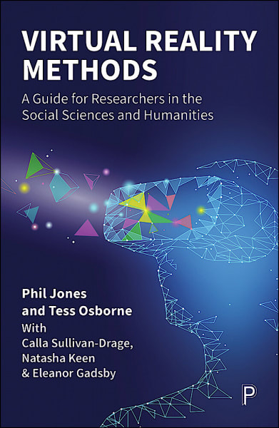
Our publisher has let us know that we're just two weeks away from the release of Virtual reality methods: a guide for researchers in the social sciences and humanities. As a result, we've been working on some of the promotional material. The most fun element of this is a launch video, which will feature shortly on the Policy Press website. For most authors these are a bit of a low-tech production; indeed, many of them seem akin to hostage videos, with authors apparently forced against their will to nervously talk about their new book into a laptop webcam. Given that Tess and I claim to be tech nerds, we thought we'd better try to do something a little more interesting, even if neither of us can claim to be natural performers on camera!
We decided we should create VR avatars of ourselves using the online platform Altspace and film our avatars talking to camera. But to make it cute, we wanted to stand 'next' to our avatars, wearing VR headsets while we controlled them. As a result, I broke out the trusty greenscreen, building on the techniques I'd learned about making lectures at home during the pandemic. How did we do it? Well, we had two headsets running Altspace which Tess and I wore, with a third Altspace avatar running independently off a PC which formed the 'camera' filming the other two avatars. All three were placed in the same generic home environment so that we appeared together and could run the output from the camera avatar into OBS and overlay it with greenscreen video of myself and Tess in the headsets. Then it was just a question of positioning our avatars in the virtual space and ourselves against the greenscreen so that we all appeared to be standing next to eachother. Okay, given that the new book is marketed on the idea that you don't have to be a technical expert to do interesting research in VR, this was maybe a bit of a nerdy approach. It took us about an hour to set everything up and then another 40 minutes or so actually recording what became a 90 second launch video. You can see why it took so long by having a look at this brief blooper reel.
This week we've also made a start on a new VR project using Altspace with the working title 'Interviews in the metaverse'. This is a collaboration with Michal Rzeszewski (Adam Mickiewicz University, Poland), Leighton Evans (Swansea University, Wales) plus Tess and her colleague Gerd Weitkamp (University of Groningen, Netherlands). The idea is that we're getting students and colleagues to interview eachother across borders, meeting as avatars in Altspace. We're doing this in pairs, with Michal and Leighton doing the Poland/Wales interviews, while myself, Tess and Gerd do the England/Netherlands interviews. Our volunteers come in and use the standard Oculus onboarding process, which teaches them how to use the controllers and gives them a chance to get used to moving around in VR. Then we sit them down and put them in a shared Altspace environment with someone from the other country. The idea is to chat a little about the experience of being at university in the different countries before coming out of VR for a normal face-to-face interview about the experience of talking to someone in VR. In the setup below you can see one of my volunteers - she's chatting in VR, but for the sake of making research notes, I've also created a recording in OBS capturing a stream of the output from their headset (so we can see what they see) synced up with webcam footage of their movements in the real world.
It's been really interesting seeing how far the metaverse discourse of 'meeting' in VR works in practice, particularly in terms of how researchers might do ethnographic interviews in VR. The two volunteers we've had on the UK side so far had quite different responses, though both agreed that they wouldn't want to spend all day in a headset doing this - the usual issue about the discomfort of having a heavy box strapped to your face. They did, however, both say that it felt like they'd met the other person in a very different way to if they'd just chatted on Zoom, though the cartoony avatars were a bit offputting. We're going to be running this on-and-off for another few weeks until the students disappear for the summer. We might then roll it out with a few PhD students/staff as well just to get a cross section of views about how well these kinds of tools work as a way of doing ethnographic interviewing. For me, the most uncanny element was watching Tess' avatar talking to one of our voluteers, hearing her voice whilst the avatar reproduced her posture and her typical gestures with scary accuracy. One for the philosophers there I think... 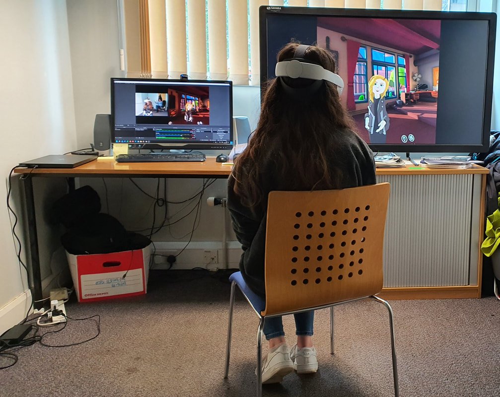
I’ve been giving a bit of thought recently to the possibilities offered by collaborative VR experiences. The point of VR is to cut you off from the world around you and to take you somewhere else, but in practice this often tends toward creating quite solitary experiences. Social VR platforms where people get together in virtual spaces can be quite interesting, but bandwidth limitations mean that the experiences are graphically underwhelming and often quite glitchy.
In the past I’ve occasionally worked with John Sear, who runs Museum Games. He’s traditionally not been a big fan of VR in part because he's really interested in activities that people do together. Nonetheless, with his encouragement, I went out this weekend to try a commercial VR escape room offered by meetspaceVR, to get a sense of what a high specification collaborative VR experience feels like. Normally, Tess would come with me on these adventures, but since she’s back in the Netherlands at the moment, Rhi stepped in as supersub. Unfortunately, the Chernobyl themed escape room we were playing crashed so we didn’t get to complete it but the very lovely people at meetspaceVR have booked us in again in a couple of weeks to finish it off. Nonetheless, the twenty minutes that we played was enough to have some initial reflections on the medium. With a social VR experience such as AltSpace VR or Facebook Horizons, individual users are trying to shove huge amounts of data at eachother across sometimes dodgy internet connections. Social VR spaces thus suffer the same kinds of problems that were seen in early online 3D social experiences such as Second Life – as soon as you get more than a handful of people in the same space, everything really slows down and often gets quite buggy. The escape room game, conversely, was being played on pretty high spec desktop PCs that were directly networked together, which meant very low latency and a genuine sense of being in the virtual space together. The headsets being used were, I think, HTC Vive Pros – certainly they had high resolution displays with no visible ‘screen door’ effect, so were comparatively comfortable in terms of eye strain compared to first generation devices. The sense of collaboration and sharing the space was genuinely impressive. We had some initial fun trying to position ourselves to shake virtual hands with each other and it was quite interesting to be able to see where your playing partner had wandered off to within the game space and so go over to join them. Microphones in the headset meant that we could talk to each other with voices at a normal volume – a lesson not learned by the group of kids who were playing before us and spent their entire time screaming at eachother and cackling manically. The game itself was quite good though Rhi was figuring out the puzzles a lot more quickly than I managed! Nonetheless, the primary thing that I struggled with was how frequently we ended up standing overly close to each other in the virtual space even though we were physically separated – a product of the fact that we were trying to figure out puzzles in the same location. We were given a choice of avatars and, unusually for me, I played as a male figure, where Rhi chose a female character. Unsurprisingly for a video game, the female avatar had her breasts prominently displayed and there were moments of real social discomfort when we ended up standing right in eachother’s space – violating the kinds of bodily norms of social distancing that we’d normally keep to. Bluntly, you could end up with a faceful of virtual cleavage if you weren’t careful. I’ll confess, I found this genuinely uncomfortable, since I would never normally stand so close to a female friend and I found myself frequently apologising for ‘bumping into’ Rhi’s avatar as she and I teleported around the gamespace. Clearly, we’re friends and it’s not such a problem when done without malicious intent, but I would find it very difficult were I doing this with someone I didn’t know because it can feel really invasive. Unwanted invasion of virtual personal space is, unfortunately, not a particularly new problem. The groping phenomenon in modern VR was already recognised back in 2016; indeed, there were even cases of rape/sexual assault being carried out in the early 1990s in text based multi-user games. In recent months, social VR platforms have seen an epidemic of groping and sexual harassment that has led Meta (previously Facebook) to create two foot ‘bubbles’ around social VR avatars to prevent unwanted virtual touching. This is, of course, all hugely depressing. The very thing that makes collaborative VR interesting – the very real sense of sharing a virtual space – is the thing that brings out the worst in all too many men. Despite this, I found myself being quite excited by what a collaborative VR experience can offer, particularly with the newer high resolution headsets which mean that, say, reading a plan or document becomes a shared possibility within the VR space. There’s definitely an interesting PhD project here on these kinds of commercial experiences, but more than this there are intriguing possibilities for larger scale research using this technology to put groups of people into the same virtual scenario. Hopefully this year I’ll find time to put a grant bid together around some of these questions. It would be nice to see whether we can find uses for collaborative VR beyond the rather unexciting future of games and tedious business meetings that Meta and others are envisioning. In 2011 Applied Geography published a paper which was designed as a kind of definitive statement from the Rescue Geography project which was my first large grant as PI. ‘The walking interview’ has gone on to be far and away my most cited paper. Indeed, it has just rolled over the 1000 citations mark according to Google Scholar.
Citations are not necessarily a mark of quality, though looking back on this paper I’m happy to say that it’s a pretty nice piece of writing. It’s based on work we had been doing with walking interviews in the Digbeth part of Birmingham. In 2007-8 when we undertook the project, Digbeth had been pencilled in for what was increasingly looking like a 1960s-style clear-and-rebuild redevelopment. Indeed, the northern part of the site adjacent to the city core had already been razed in anticipation of building a Richard Rogers-designed library. The library project never happened and the area was left vacant for many years – although now it’s the site for HS2’s new Curzon Street Station. Our research project was trying to capture something of the spirit of Digbeth before it was wiped off the map, although, as it turned out, the credit crunch came along and scuppered those comprehensive redevelopment plans. We weren’t the first people to use walking interviews as a technique, far from it, but the novelty of our project was in using GPS to record where the interviews took place. By joining the GPS tracks to the interview transcripts, we were able to see whether where people walked had an impact on what they talked about. The 2011 Applied Geography paper demonstrated for the first time that not only did walking interviews generate more place-based commentary than a traditional sit-down interview, but that this material directly related to what people could see from where they were walking. In essence, it demonstrated that if you want rich information from participants about an environment then being in that environment can be very productive. An obvious point, perhaps, but by clearly demonstrating this we set ourselves up for having a ‘must-cite’ paper for anyone writing about a project using walking as a research technique. Giving the paper a simple title ‘The walking interview’ made it really easy for people interested in the topic to find our paper. I must admit, since this point I’ve resisted the common social science tendency to create slightly opaque paper titles with quotes from participants or bad puns. The paper had a bit of a chequered history, starting life as a draft for the end of project report, which was then reworked and bounced by Transactions but with some very helpful referees’ comments. In summer 2010 I spent a few days in a cottage on the north coast of Scotland rewriting the paper in line with these comments and sent it off to Applied Geography. It’s the only paper I’ve ever had ‘desk accepted’ in that the editor didn’t bother sending it out for review but automatically agreed to publish it – subject to inserting a few more references to Applied Geography papers in order to help increase the journal’s Impact Factor. Interestingly, the paper didn’t do so well on our internal University of Birmingham review process for those papers being submitted to REF 2014. Indeed, it was seen very much as the weakest paper that was submitted to REF against my name – although qualitative methodologies was subsequently flagged as a strength of Birmingham in the feedback from the REF panel. I subsequently took over our internal process for REF 2021 and have encouraged my colleagues to take a more positive attitude to methodology papers since they have generally been quite well regarded by REF panels. We’ll see if I’m proved right next year when the REF results come out. The fact that this paper has been so ridiculously successful in terms of citation count makes me immensely proud but also prompts a little melancholy. My PhD supervisor Jeremy Whitehand passed away earlier this year – a very lovely man, kind, generous and an incredible scholar. Beyond his core research in urban morphology, he was interested in the mechanics of scholarship and a quite brilliant editor. In 1985 he published a paper in Transactions that undertook an analysis of citations within human geography, exploring how patterns of citation told a story about who was reading human geography publications and what ideas were being widely diffused within the academy. He used the word ‘centurions’ as a shorthand for highly cited human geographers – reflecting those who had had a total of more than 100 citations for their publications. Of course, Jeremy didn’t have the benefit of the huge citation databases that we have now, with he and his wife Susan painstakingly manually calculating the kinds of things that we look up in an instant today. Of the most cited human geographers from 1971-75, Brian Berry came top with 890 citations; there were only 32 human geographers in this period that had more than 100 citations. The idea that today it isn’t particularly unusual for a single paper in human geography to crack 100 citations across four years (let alone 1000 over ten years) really gives a sense of how the academy changed during Jeremy’s long and productive life. This is a slightly self-indulgent post and I promise that normal service will resume shortly with intermittent blogs about random tech things (I’ve just bought a VR headset with built-in eye tracking, so watch this space!). Nonetheless, I remain very pleased with the 2011 Applied Geography paper. It certainly got me thinking about the possibility of writing at least some papers that clearly demonstrate something of value and interest to the wider academic community and beyond. In this regard, I very much see the green prisons project with Dom Moran and the biosensing work with Tess Osborne as being spiritual successors to the walking paper from ten years ago. Though, of course, that’s not to say that I don’t still enjoy the occasional bit of cultural geography navel gazing… References Evans J and Jones P (2011) The walking interview: methodology, mobility and place. Applied Geography 31(2): 849-858. Whitehand JWR (1985) Contributors to the recent development and influence of human geography: what citation analysis suggests. Transactions of the Institute of British Geographers 10(2): 222-234. 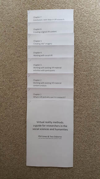 Tess and I have just sent off the manuscript for a new book to Bristol University Press. Assuming the publishers don’t hate it, Virtual reality methods: a guide for researchers in the social sciences and humanities should be coming out sometime in Spring 2022. The reason for talking about this here is not simple self-promotion (although of course there’s always an element of that in this blog) but as a chance to reflect a little bit on getting students involved with research.
The book is co-authored between myself and Tess, with three of our former masters students who did projects within my Playful Methods Lab. All three had previously taken my third year undergraduate module which featured material on embodiment and technology and used their masters year to work with me to expand on these ideas. The book is structured around critical reviews of different methods for using VR in research, with each chapter also containing a brief worked example from the lab, three of which came from these masters projects. After a bit of negotiation with the publishers, they agreed that we could give Calla, Tash and Eleanor a ‘with’ author credit, since we were drawing on parts of their work. As a result, the book in some ways represents a bit of a mission statement for an agenda I’ve been promoting at Birmingham to get students emerging from their degree as confident, independent researchers. This isn’t about trying to drag more students into PhD programmes but rather trying to equip them with useful employability skills of being able to identify problems and work on tasks to produce solutions. We’ve restructured our first year programme to build in applied skills from the start of their degrees. I blogged last year about rewriting our GIS teaching. Some of this was about switching from ArcGIS to QGIS so that students could more easily work remotely in the context of the pandemic. More than this, however, the rewritten material was about introducing some basic techniques but focussed on asking them to design their own research projects drawing on these newly learned skills. I’d said to myself at the start of the term that if I could just get them being able to confidently find demographic and make choropleth maps of it without being led through it step-by-step then I would treat that as a huge win. As it turned out, the students produced a wide range of really interesting projects, from census and crime mapping, to looking at air quality and river systems. What gave me most joy, however, was the way that the students were able to apply their GIS skills to other projects. The GIS module is linked to a fieldcourse. Naturally, the students weren’t able to travel this year, so we ran a virtual trip, with staff members ‘taking’ groups to different locations and asking them to apply their research skills to developing research projects about those locations. These projects mostly relied on secondary data sources – though some set up Zoom interviews and online questionnaires. I asked my group of 20 students to investigate topics relating to Melbourne and casually suggested that they might want to make some GIS maps to help their investigations. With no more help from me than giving them the idea, they went off and found Australian census data and shapefiles and produced a whole host of maps that were relevant to their projects. In the old days our students never really did much independent research until their dissertations, which were much more stressful projects as a result because they had relatively little experience of this. By putting research at the heart of the programme now, we’re seeing the confidence in their skills increasing, with a greater willingness to take module content and begin to apply it to explore their own interests. We’re hoping that this makes a real difference to the way that our students are able to sell themselves when applying for jobs. It also means that as we go forward we should have many more projects like those of Calla, Tash and Eleanor that are interesting enough to make their way into the wider scholarly canon. 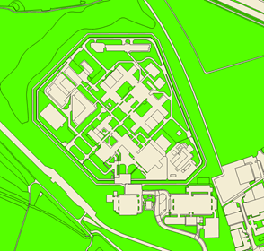 OS Mastermap Topography layer showing HMP Holme House. ©2019 Ordnance Survey OS Mastermap Topography layer showing HMP Holme House. ©2019 Ordnance Survey One of the things about being a methods scholar is that you can flit about between subjects. For a job interview a couple of years ago I made a list of the different disciplinary backgrounds of people that I’d collaborated with. This included those working in hydrology, law, design, planning, sociology, psychology, social work, heritage studies, poetry, photography and performance art. It’s quite fun to learn about other people’s approaches to different topics and think about how your own expertise can help bring something useful to the discussion.
Carceral geographer Dom Moran and I have been friends and colleagues for over 17 years but had never actually written anything together until collaborating to produce a paper that has just come out in the Annals of the AAG. I’m not going to talk too much here about the specific findings of the paper here – you can have a look at the press release or the paper itself if you’re interested – instead I want to reflect on how the paper came about. Back in pre-Covid times Dom and I would occasionally go for coffee. There’d be a lot of the kind of chat you’d associate with old friends: various bits of banter, talking about her charming and mischievous daughter and, of course, gossip about work. But we’d also kick around research ideas, and back in 2018 we were both getting interested in green space, albeit for different reasons. I’d been working to develop a grant application with a bioscientist and an ecologist around physiological response to green environments. Dom, meanwhile, was generating really interesting qualitative data about the positive effects of exposure to greenspace on prisoner wellbeing. Over coffee, however, she was talking about how policymakers prefer hard numbers when seeking to change the management of prisons. We’d already been chatting about prison violence statistics, which are available as open data for UK jails and make for pretty horrendous reading. It occurred to us that if we could measure prisoners’ exposure to green space, we could perhaps see if there were any connections between this and violence. As someone who enjoys playing around with GIS, I wondered whether there were datasets available that could indicate how much greenspace exists in and around a prison – the simple presence of greenspace acting as a crude proxy for exposure. The MasterMap Topography dataset is the Ordnance Survey’s highest resolution mapping for the UK, operating at the 1:1250 scale. Building footprints, exercise yards, football pitches etc. within prisons are all carefully surveyed and mapped with a great deal of accuracy. MasterMap also tells you what type of surface you’re looking at, hence an all-weather sports pitch is labelled as artificial, where a grass verge as shown as a green ‘natural’ surface. Thus, we were able to accurately measure the amount of green space both inside and immediately outside the prison walls. Dom went off and secured some UoB ‘impact’ funds to pay for a PhD student from Archaeology (the very excellent Amy Porter) to download and analyse MasterMap data for all prisons in England and Wales to create a spreadsheet of how much green space there was in and around each of them. This spreadsheet could then be combined with the violence statistics to start to look for statistically robust relationships. Neither Dom nor I, however, have the skills to do this. Hence Dom called on an old friend and former colleague of ours, the econometric modeller Jacob Jordaan from Utrecht University. He was able to run the numbers and demonstrate that even allowing for other factors such as age and type of prison, as the amount of green space increases so you see a statistically significant decrease in levels of violence. This has then given Dom the material to lead a whole bunch of papers exploring different aspects of the dataset, of which the one in Annals is the first to come out. This is pretty cool and obviously really helpful for giving policymakers a robust analysis to inform prison design. But more than this, it illustrates how some projects really do rely on a group of people with different expertise coming together. Dom’s knowledge of prisons, my knowledge of GIS and Jacob’s knowledge of statistical modelling were all vital to this research and none of us would have been in a position to conceive and deliver the project without the others’ input. Plus, it was great fun to work on, which all the best projects are, particularly when you’re collaborating with such lovely people. 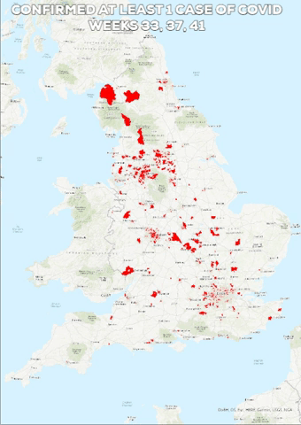 For the last few weeks I've been teaching a new GIS class, getting our students to learn some basic techniques in Google Earth and QGIS. The idea is that they will then apply some of these techniques to investigating their own research question. There's already been some great ideas that they've come up with, such as mapping wifi signal strength around campus. Inevitably, of course, some of them have been thinking about what can be done with the government's Covid data. As I write, numbers are rising at an alarming rate as the UK is firmly into its second wave. The government releases data at the MSOA level on a weekly basis. Week 41 represents the week beginning 5 October 2020. Just looking at where districts in England have recorded a single case, in the eight weeks between week 33 and week 41, we see cases changing from being quite a rarity and concentrated in particular urban areas, to there hardly being any MSOAs in England without a live case last week. In and of itself, this is fairly depressing, but I was interested to drill down a little bit more and look at where the worst cases are concentrated and whether we see any relationship with where we have studentified districts - i.e. neighbourhoods where we see a disproportionate number of young people living. For the purpose of this exercise I've highlighted neighbourhoods where more than 30% of the population are aged 18-22. The highest of these (59.1%) covers the Selly Oak neighbourhood directly opposite the University of Birmingham. Truly a fun place for non-students to live... If we look at the MSOAs falling into the highest quintile of the number of cases per week (i.e. rather than comparing absolute numbers to allow for the fact that the overall number of cases is increasing rapidly) then we can start to compare what's happening in weeks 37 (i.e. before the start of most UK university terms) and week 41 - last week as I write this. The pink shading is MSOAs falling into the top quintile of cases and the hatched shading is where we have 30-60% of the population in the 18-22 year old band. In the example from Stoke on Trent, we see that the studentified area around the University of Keele isn't a hotspot in week 37, but has become one in week 41. In the Birmingham case, the studentified areas relating to University of Birmingham in the south and BCU/Aston to the north are in the worst quintile for Covid in both cases but we can see by week 41, quite a few other areas of the city have, comparatively, faired better i.e. that the highest numbers of cases are concentrating in particular districts, including those studentified areas. Indeed, if we narrow this even further and look at the very worst areas for cases in week 41 (between 40 and 651 cases, i.e. the worst 3.5% of MSOAs in England), then the presence of studentified areas associated with different universities is even more obvious. Of course, there's a crucial caveat here. Co-presence is not the same as correlation and I am not qualified to run the stats on this. It would be good for a stats specialist to run the underlying datasets through R to see if there are any interesting and statistically significant relationships between the numbers. Certainly a basic scatterplot suggests reason to do some more careful statistical investigation. 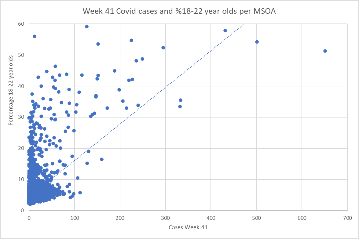 It's also important to say that this isn't about blaming students. Teaching on campus I find that our students are incredibly respectful of social distancing. Frankly, many are voting with their feet. Campus is unusually quiet and a high proportion of my students seem to prefer coming to the alternative online seminars rather than face-to-face sessions. But students live in crowded conditions - both in halls and in private accommodation - and even if the vast majority are obeying all the rules, it only takes a tiny number of careless individuals to put a large number of their peers at risk. They also seem to be very diligent about getting tested, which inevitably increases the reported cases.
This is also not about blaming the universities. I have to say that my employer has done a huge amount to make the return to campus as safe as it can be in the circumstances. It's not ideal, but I genuinely feel pretty safe when I'm on campus because of all the measures that have been put in place. It's really not the fault of the universities that we are open given that the government has been very clear that we should be. What the above analysis indicates, however, is that there are questions to be asked about whether that instruction from central government is sensible in the current circumstances. |
AuthorPhil Jones is a cultural geographer based at the University of Birmingham. Archives
September 2023
Categories |
Phil Jones, Geographer
The INTERMITTENTLY updated blog
 RSS Feed
Proudly powered by Weebly