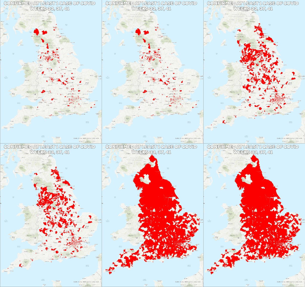
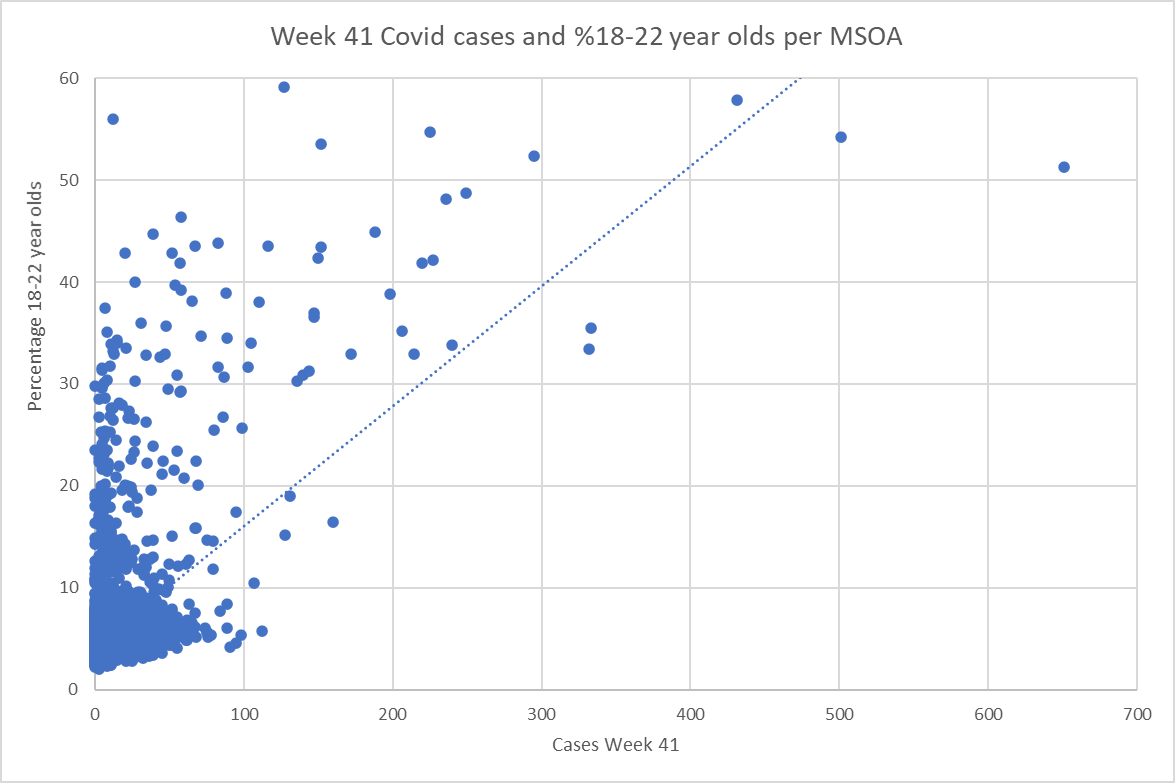
 For the last few weeks I've been teaching a new GIS class, getting our students to learn some basic techniques in Google Earth and QGIS. The idea is that they will then apply some of these techniques to investigating their own research question. There's already been some great ideas that they've come up with, such as mapping wifi signal strength around campus. Inevitably, of course, some of them have been thinking about what can be done with the government's Covid data. As I write, numbers are rising at an alarming rate as the UK is firmly into its second wave. The government releases data at the MSOA level on a weekly basis. Week 41 represents the week beginning 5 October 2020. Just looking at where districts in England have recorded a single case, in the eight weeks between week 33 and week 41, we see cases changing from being quite a rarity and concentrated in particular urban areas, to there hardly being any MSOAs in England without a live case last week. In and of itself, this is fairly depressing, but I was interested to drill down a little bit more and look at where the worst cases are concentrated and whether we see any relationship with where we have studentified districts - i.e. neighbourhoods where we see a disproportionate number of young people living. For the purpose of this exercise I've highlighted neighbourhoods where more than 30% of the population are aged 18-22. The highest of these (59.1%) covers the Selly Oak neighbourhood directly opposite the University of Birmingham. Truly a fun place for non-students to live... If we look at the MSOAs falling into the highest quintile of the number of cases per week (i.e. rather than comparing absolute numbers to allow for the fact that the overall number of cases is increasing rapidly) then we can start to compare what's happening in weeks 37 (i.e. before the start of most UK university terms) and week 41 - last week as I write this. The pink shading is MSOAs falling into the top quintile of cases and the hatched shading is where we have 30-60% of the population in the 18-22 year old band. In the example from Stoke on Trent, we see that the studentified area around the University of Keele isn't a hotspot in week 37, but has become one in week 41. In the Birmingham case, the studentified areas relating to University of Birmingham in the south and BCU/Aston to the north are in the worst quintile for Covid in both cases but we can see by week 41, quite a few other areas of the city have, comparatively, faired better i.e. that the highest numbers of cases are concentrating in particular districts, including those studentified areas. Indeed, if we narrow this even further and look at the very worst areas for cases in week 41 (between 40 and 651 cases, i.e. the worst 3.5% of MSOAs in England), then the presence of studentified areas associated with different universities is even more obvious. Of course, there's a crucial caveat here. Co-presence is not the same as correlation and I am not qualified to run the stats on this. It would be good for a stats specialist to run the underlying datasets through R to see if there are any interesting and statistically significant relationships between the numbers. Certainly a basic scatterplot suggests reason to do some more careful statistical investigation. It's also important to say that this isn't about blaming students. Teaching on campus I find that our students are incredibly respectful of social distancing. Frankly, many are voting with their feet. Campus is unusually quiet and a high proportion of my students seem to prefer coming to the alternative online seminars rather than face-to-face sessions. But students live in crowded conditions - both in halls and in private accommodation - and even if the vast majority are obeying all the rules, it only takes a tiny number of careless individuals to put a large number of their peers at risk. They also seem to be very diligent about getting tested, which inevitably increases the reported cases.
This is also not about blaming the universities. I have to say that my employer has done a huge amount to make the return to campus as safe as it can be in the circumstances. It's not ideal, but I genuinely feel pretty safe when I'm on campus because of all the measures that have been put in place. It's really not the fault of the universities that we are open given that the government has been very clear that we should be. What the above analysis indicates, however, is that there are questions to be asked about whether that instruction from central government is sensible in the current circumstances.
0 Comments
|
AuthorPhil Jones is a cultural geographer based at the University of Birmingham. Archives
September 2023
Categories |
Phil Jones, Geographer
The INTERMITTENTLY updated blog
Proudly powered by Weebly

 RSS Feed